What is inclusive design?
Inclusive design is about enabling anyone with a disability (a mismatch between your ability and the world around you - everything from blindness to dyslexia to projectors with poor contrast and beyond) to efficiently and effectively use your product.
I was part of a team of subject matter experts from the PM, Design, and Engineering disciplines that pushed our product into the world of inclusive design.
Why should I care?
Most engineers, PMs, and designers do not have disabilities. People who don't experience the inconvenience of trying to use products that are not designed inclusively often don't know how to make their products accessible, or even that they should try.
Part of our push was about culture shift - educating everyone in our organization and building empathy and understanding for the people who use our products but can't interact with them the same way as most. We were extremely lucky that several people in our company have stepped forward as spokespersons. Through conversations with our peers who experience the pain of using our products, we gained a deeper understanding of not only what needs to be fixed, but why it needs to be fixed.
So What Changed?
Inclusive design, or accessibility, is broad, but can be roughly broken down into these three areas.
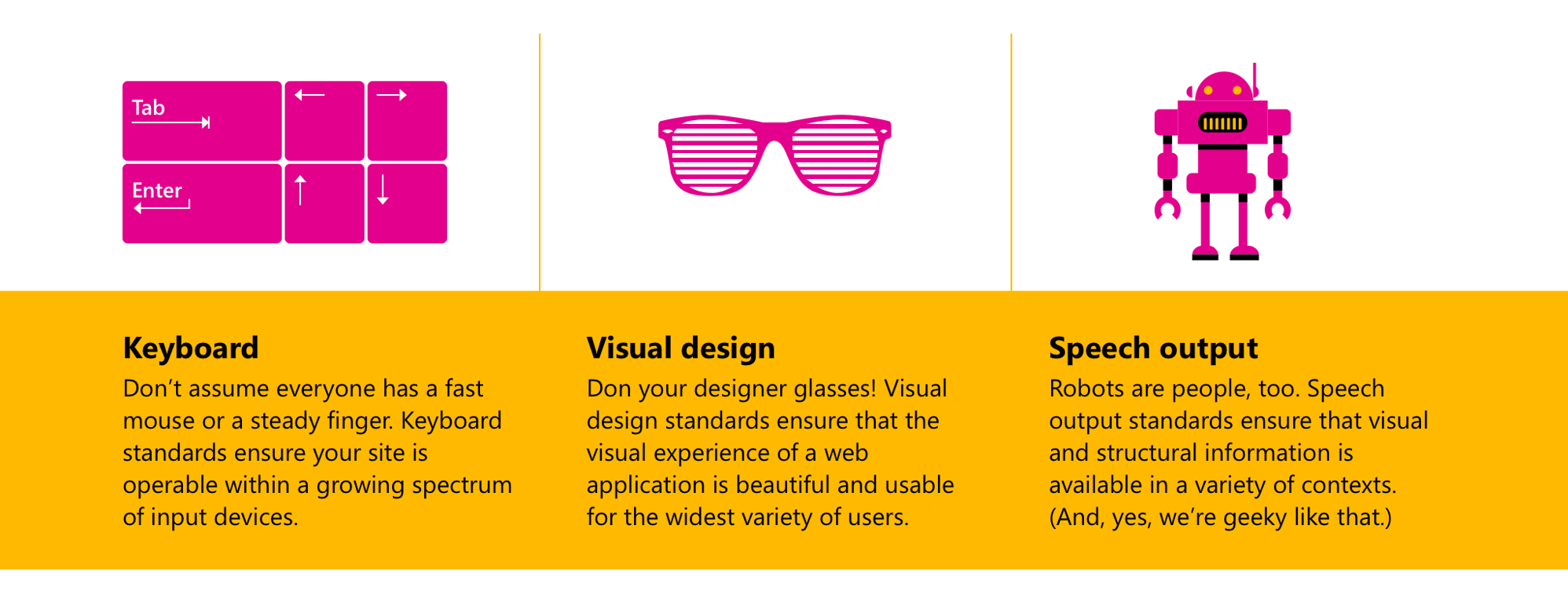
Keyboard
The quality of keyboard interaction affects people who lack fine motor control, but you don't need to have a permanent disability to benefit from improvements to keyboard interaction. Many software developers find that they are more effective if they never have to take their hands off the keyboard and will go to great lengths to reduce their need for a mouse. Anyone who has tried to use a touch pad/screen or mouse on a turbulent flight or in the back of a bus knows how situational the effectiveness of these technologies are. Universally available keyboard interaction improves the experience for every one of these personas.
There are two major components to good keyboard interaction design: completeness and predictability. The most important thing to remember when designing for keyboard is that everything you are able to do with a keyboard or touch screen should be possible by exclusively using a keyboard. Once you know what needs to be accessible, the next question is: how? Conveniently, there are standards for this: the ARIA design patterns. These standards, set forth by the W3C, are the source of truth for how users should interact with common control types (grids, input elements, calendar controls, etc) with a keyboard. Using these guidelines verbatim, or basing design decisions off of them when your control is not "common" is the easiest way to implement an experience that is intuitive and efficient to use.
Visual Design
While supporting the brand of the product, visual design needs to lead users down the path of success, no matter who they are and how they are viewing the experience. Approximately 8% of men are color blind (according to colourblindawareness.org), and if you've ever looked at your tablet on a bright summer day or been subjected to a long presentation in a room with an old projector, you know how easily the contrast in images can vanish.
The exclusive use of color to indicate meaning blocks anyone who has trouble distinguishing between hues, because of their body or their situation, from using your product. Adding an icon or some text not only helps these users but makes your experience more scanable, as the human eye can more easily differentiate between shapes than colors.
The visual design of a webpage can be improved for all users by maintaining a color contrast ratio of 4.5:1 between visually distinct elements - especially text and its background color. This is easy to detect with automated testing and can be fixed by using colors from a set color palette that has been pre-tested for contrast.
For users who require a stronger guarantee of readability, windows has a "high contrast mode" that strips all defined colors out of an experience, replacing them with strong outlines in highly contrasting colors. Part of high contrast mode, though, is that it strips away any background images or sprites, so if you're relying on an image of text, or your site's background, or image icons, your user will not be able to use your page. This is an area where good accessible design is just plain good design. Images of text are always bad and icons are easier to keep standard if they are a custom font.
Speech Output
"UX" and "UI" have almost become synonymous with "Visual design" in web development, but there are users out there that rely on third party software to translate that visual design into auditory design, and the user experience or interaction design is not complete until it accounts for their needs. People who are blind often use screen readers - software that "reads" content to them and provides enhanced keyboard interaction. If your website is hacked together out of home-brew controls, the chances of a screen reader knowing how to interpret it is low and blind users will find it impossible to use. Not everyone who uses a screenreader is blind, though. People who have dyslexia, or other cognitive conditions that make reading text unreliable or difficult, use screenreaders to make the words on a page more easily consumable, even if they can see the page itself.


What can I do?
Is that really all there is to it?
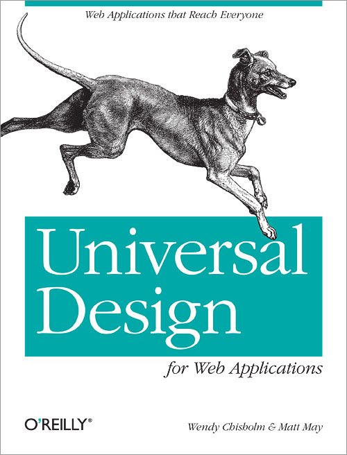
Yes! And no. If you'd like to learn more about accessibility, check out Universal Design by Wendy Chisholm, one of the people driving this push and accessibility consultant for Microsoft.
As our advancing technology pushes us towards a mobile-first hands-free world, more an more of our interactions with the web will be through intermediaries like Siri or Cortana. These programs function much like a screenreader and only know as much about your experience as you are willing to tell them. Similarly, search engines are both deaf and blind - if your website is easy for a screenreader to interpret, your SEO will be better.
Design for assistive technologies like screenreaders is the hardest part of inclusive design - not because it's hard to add a "role" attribute to a control so that the screenreader knows how to interact with it, but because you need to figure out what "role" the control should be, and make sure it behaves as that role would indicate. The ARIA design patterns are the source of truth here. Unfortunately, it's common that someone has thought up some revolutionary new piece of functionality to put on this web page that doesn't fit any design pattern. That's when you have to sit down and do some real end to end experience design.
The best thing you can do, for screenreaders and for the quality of your code, is use a standard dom element. If your experience needs a button, use a button element, not a div with a role attribute of "button" with special click handling. If your control is genuinely useful and unique, the you can combine existing patterns in the simplest way possible and describe any remaining functionality for the screenreader. Always keep in mind that if your product is hard for a screenreader to understand, it is hard for a human to understand - this might be a sign that you need to re-think your design.